
Plaster patched, trim repaired, floor covered, and ceiling done, I was ready to paint my bedroom walls. I even knew the exact color I wanted. The room would still be blue, but not a pallid baby blue similar to what was on the walls now. I was a going to have a richer, deeper blue. One you could sink into, and take a swim in. Deep enough to lull you to sleep during your afternoon nap, but so deep as to drown in, or feel inky at night. It would have a little complexity, with undertones of other colors to add dimension, allowing the changing light over the course of a day to cast subtle shifts in its hue. With that in mind, I was ready to walk into the paint store, choose the color sample matching the one so strongly imbedded in my head, buy the paint, and get started. Nothing could be simpler, right?
Wrong.
It began fine. I confidently strode into Red Hook Wallpaper and Paint, greeting the owners John and Lisa who asked if I needed any help.
“No!”, I brightly replied, “I know exactly what I am looking for! “
Then I hit a wall.
A big, fat wall, of color.
Make that several walls of color.
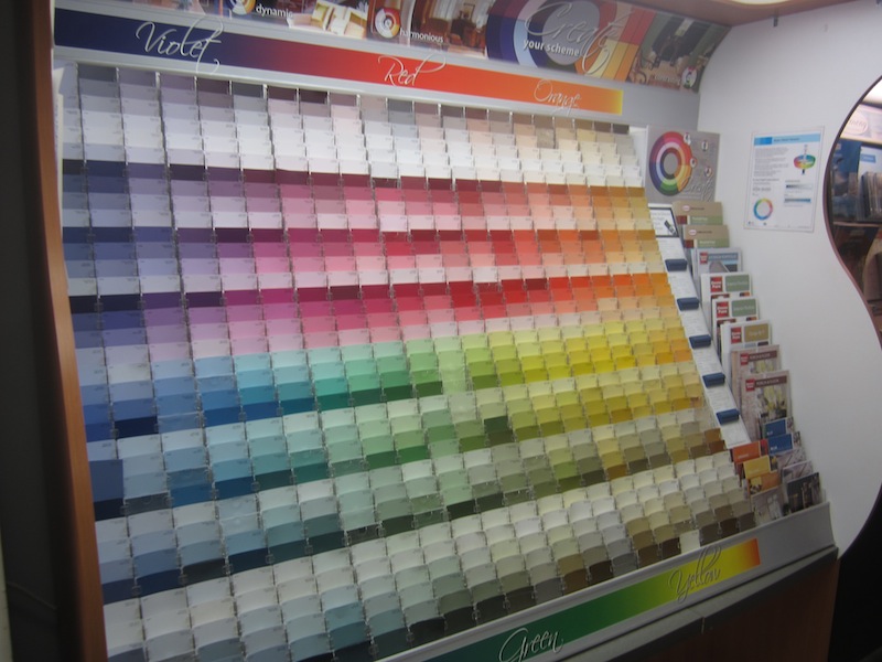
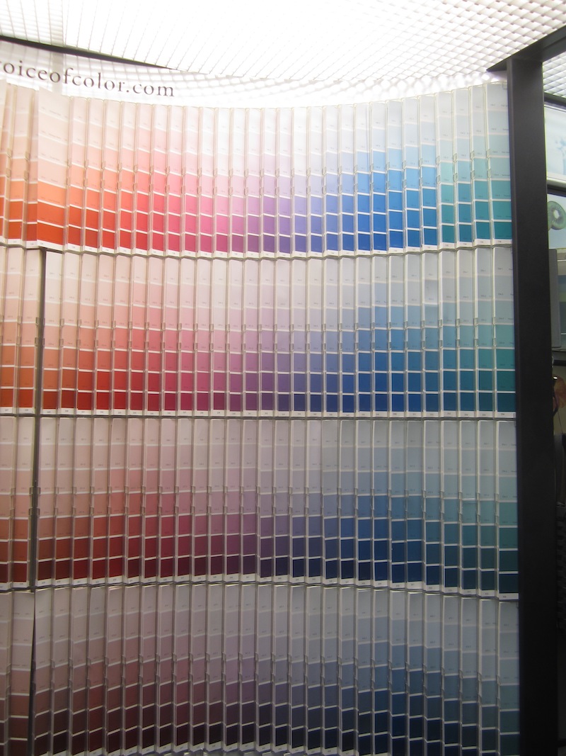
Twenty feet of little, little color samples on walls each almost imperceptively different than the next. Compounding the issue, each paint manufacturer had separate sections of color displays, each presenting similar, but not identical choices
Humans have not yet evolved to have a cmyk converter embedded in their brains to match the colors in their minds, and science has been no help. Even after eliminating all the other colors but blue, there were still hundreds of options. The variety was so vast and overwhelming it is hard to understand why these contraptions don’t come equipped with attached ritalin dispensers. I tried to focus though. Closing my eyes, I summoned up the color I was so certain about earlier from the back of my head. I opened them. To my delight, there it was, right in front of me - the blue I had been thinking of! Great! I pulled the color sample out, holding the perfect match in my hand contentedly. Then something flashed in the corner of my eye, ruining this perfect moment. On the next color display over was another blue sample that matched the one in my head. I went and grabbed it. Yes that was definitely the one I was thinking of. I took the second color sample and compared it to the first. They were both exactly the color I was looking for, but they weren’t the same color at all. Just then a third blue jumped out at me. There! There it was ! THAT’S DEFINITELY THE COLOR. I think. I closed my eyes again, and summoned the color in my head to reappear and break the three way tie, but it seemed to be on a coffee break. This went on several more times. How could something that had been so real in my head be be so confused? How could I be certain I was picking the real color, or a clever imposter? Only at that moment did I truly understand how so many relatives of the Grand Duchess Anastasia could be taken in by Anna Anderson’s claims.
Lisa came to the rescue with some sage advice and a paper bag for me to breathe into. Following her counsel, I stopped looking at any more blues and took the samples I had already chosen home, putting them in my room to see how I felt about them in the actual space.
Arrayed on the mantel like ten semi-finalists on a pageant stage, I scrutinized them closely, observing them under day, evening and swimsuit light conditions. As in most beauty contests, it came down to two finalists that I liked equally as well, but knew I had to find something to give one the edge over the other. In the end, the choice was helped through no fault of their one, but an issue plaguing todays paint industry. Namely, who are the people they hire to name the paint colors?? Don’t they realize that both men and woman buy paint? Knowing that the perception of something changes the second you put a label on it, and with all of the safe, gender neutral words out in the universe, why they chose names they do for colors defies logic and reason. Three shades of red, all of which could appeal to me, are named “Misty Dawn”, “Elizabethan Rose” and “Delta Red”. Do I want to think of a Hee Haw Honey, a pallid Englishwoman with a plucked hairline, or an overweight exotic dancer wearing a hand-darned g-string when looking at the color of my walls? The nadir however, in paint color name choices had to be when this was chosen for an otherwise innocent blue.
 Don’t get me wrong, I truly loved my Nanny, but if someone asks me the name of the color on the walls in my bedroom, and I answer “grandma’s sweater”, what kind of inferences could I expect be drawn about me? Camphor and mothballs at best, creepy grand-oedipal at worst! At that point in my life, I could not cope with a floral, feminine, cuddly, or childlike reference when in the room I slept in. The two blue finalists for the color of my room happened to be equally appealing on a pure visual level, and almost impossible to tell apart at first glance.
 One, however, bore the name “Pure Periwinkle”. Which do you think I went with?
Having teetered on the abyss long enough, I took the plunge (and bought the paint). The more I painted, the more confident I was in my color selection.
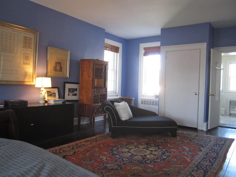
It was “Bye, bye baby blue”, and “Hello, Harlequin!” (the name of the color I finally went with. It felt richer, and changed appearance under different lighting conditions and time of day just as I hoped it would.
 I acquired a few new things for the room to further make it my own. A newly acquired empire sleigh bed and worn oriental carpets entered the space. Some antique family pieces were mixed with a contemporary solid dresser from my old apartment and some black and white photographs for a modern balance. I picked up some large scale gold framed architectural drawings at auction and hug them on the walls. I felt it struck just the right tone, a little antique mixed with modern, confident and grown-up but not too serious, and masculine enough, without dragging hairy knuckles along the floor. I dubbed it a success. In contrast to other things I dub in my head, others actually agreed!
My friend Richard liked it so much he wanted to replicate it on a bedroom in his home in Savannah. He called one day to see if I had the specific paint color or formula.
“One thing though” he asked “ do you think might be a little, too cornflowery?” Now, Richard and I both play on the “same team” so to speak, and while I don’t think of myself as overly effeminate, but put us side by side in a North Carolina church, and I am fairly certain I would be the one the Pastor would urge his congregation to give a good punch to.
“Don’t be silly” I answered, “It’s not Cornflower, it’s Harlequin”.
“HARLEQUIN”??!!! came yelping back at me through the line.
It hadn’t occurred to me before that the image of a masked man in a diamond patterned costume wearing tights and a tri-pointed hat with bells dangling off of it might be considered something less than masculine.
“Don’t worry, don’t worry”, I urged, “It will look fine”.
I was down in Savannah visiting while he was painting the room. Lisa had emailed down the exact cmyk breakdown and chart number so a local store there could mix the same color. We both agreed it was a vast improvement, and Richard seemed very happy. Then a little doubt crept in.
“Are you sure it’s the same color as your room?” He asked with the slightest hint of skepticism. We took pictures of his room, and compared them to photos of mine. They looked the same, more or less, but it was hard to say, given the differences in light conditions and trim color.

 Richards Room
 My Room
A week or two after I returned home, I received another call.
“Someone came to the house the other day, walked in the room, and exclaimed “Periwinkle! “
Pshaw ! I exclaimed back “They probably just possessed a limited vocabulary, and didn’t even know what a harlequin blue looks like! I know, I will paint a swatch with my blue , send it down so you can hold it up next to your wall and compare.” He duly performed the experiment, holding my color sample next this wall and took a photo.
Honestly, I can’t really tell. They are darned close, but maybe not a perfect match. Perhaps because his is painted over a dark tan base. Perhaps because even though the woman at the paint store in Savannah followed the same formula, different brands of paints and pigments are every so slightly different, turning a harlequin blue a hair in the pure periwinkle direction. Even if so (and I am not saying it is), things could be worse. I don’t think Richards bedroom wall color will ever be mistaken for “Grandma’s Sweater”.